
KitchenAid Cook Processor Connect
Interactive display.
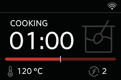
While working at Whirlpool I was tasked with designing an interactive display for the KitchenAid Cook Processor Connect. The original version of this product had a seven-segment display. For the new version they wanted to provide users with a larger LCD screen that provided additional feedback. Along with being able to control time, temperature, and speed, there was also a need to visualize a weight scale and progress through a multistep recipe, while keeping in mind the need for multilingual support.

METHODS USED:
Brainstorming, Rough Sketches, Benchmarking, Information Architecture, UX Wireframes, Interface Design, User Testing, Revisions, Client Approval, Design Handoff
CES 2019 Best of Innovations: Smart Home Award
MY ROLE
I was the Primary Designer on this project for four months, taking it from sketches to a design-handoff state. I worked with the Lead User Experience Specialist for KitchenAid. An additional UX Designer supported the project, and two graphic designers supplied the final icons. The UI was reviewed by my manager.
DISCOVERY
Exceeding expectations.
After brainstorming concepts and creating initial hand-drawn sketches of the primary screens, I brought the concept to life in Sketch. Having access to several of the competitors’ products for testing assured that this product met or exceeded the current market experience. Collaborating with the team to refine the flow for each user journey, I discovered potential points of frustration and worked to create and revise a solution that was simple to understand. I helped conduct user testing on the product itself to see if there were any additional pain points to work through.


CREATION
Finding solutions despite limitations.
There were several unique aspects of this project that required creative solutions. A primary challenge was that all graphics and text were limited to a fixed 16-color palette. I experimented and tweaked a color palette that not only included the right amount of grays for text and icons to appear crisp, but also allowed for two additional colors, red and yellow, to be used sparingly throughout the experience. Working with the development team while the product was in the early stages also allowed me to verify that the design intent was captured, and make adjustments when needed to ensure the best possible end product.
It was great to see the product launch in January 2019 and take home a CES 2019 Best of Innovations: Smart Home Award.
